Letter to a Bostonian
Writing my book on classic planning I revisited Boston. Walking around from the place I was staying on Boston Common, I found myself charmed by it. Looking more closely at Boston’s pre-World War II architecture with author James Stevens Curl, we concluded that Boston’s traditional architecture was exceedingly well-built and sustainable. Attending a lecture by him on his book Making Dystopia, it came to mind that the problem with Boston’s urbanism is Cambridge.
Although Harvard, and MIT are venerable institutions, their architecture and planning programs have ironically spawned many of the worst urban ideas of the 20th century. Tragically, these ideas were tried out first on poor Boston, the subject of experiments by mad planners on the city’s innocent citizenry. Indeed, in the past 75 years the city’s planners have systematically inflicted on poor Boston every possible urban insult known to man, much of it in the name of unadorned “functionalism.”
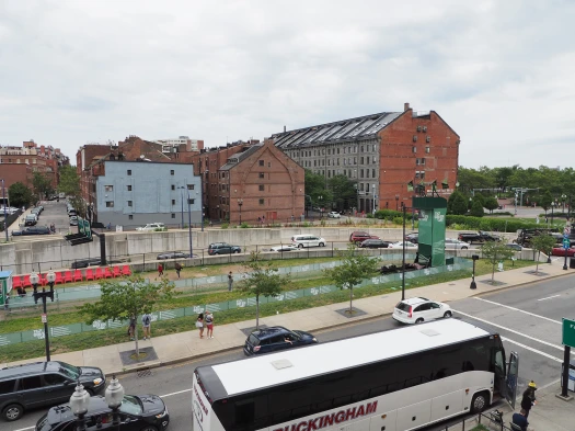
The people of Boston, America’s oldest major city, consider lack of pretense a virtue. But they may have confused the brutally minimal and completely arbitrary trappings of “cool” Modernist design with genuine humility. With bad architecture its planners have made Boston less charming and increasingly intolerable. Urban Renewal and traffic planning have wrecked the city with destructive freeways and ungainly bridges. Zealously-applied Modernism has mutilated its lovely neighborhoods and left the city in tatters. Still 100,000 people short, 15% off of its 1950s population peak, the chicken and egg question is whether the new ugliness results from its emptying out, or that Modernist ugliness caused it.
Since its classic planning foundation, Boston has had some of the prettiest urban places in the US. Until the mid-20th century its 125 foot (38 m) skyline was punctuated only by church steeples, domes, and by the 496 ft (151 m) tall federal Custom House Tower designed by Peabody and Stearns (1915).
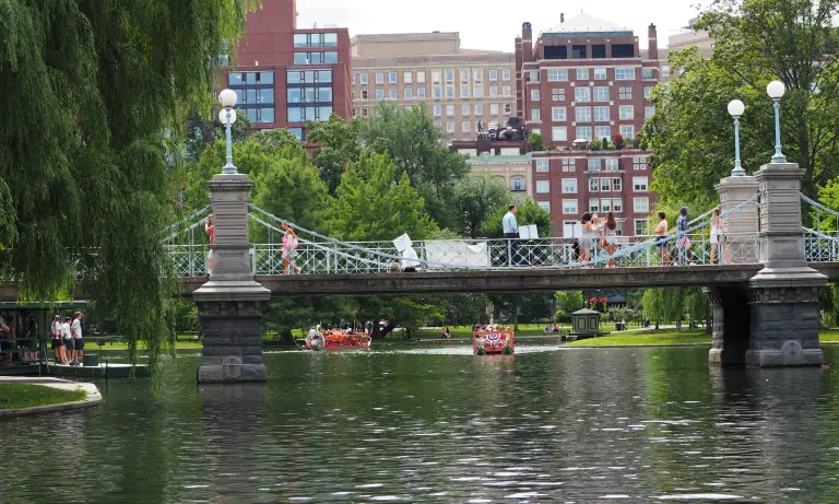
The best parts of Boston are classic planned and we don’t even know it. Quincy Market, the Boston Common, the Public Garden, Haymarket Square, Old North Church, and the main commercial streets of the Back Bay and Beacon Hill, feature some of the best architecture in the Americas.
The best parts of Boston are classic planned and we don’t even know it. Quincy Market, the Boston Common, the Public Garden, Haymarket Square, Old North Church, and the main commercial streets of the Back Bay and Beacon Hill, feature some of the best architecture in the Americas.

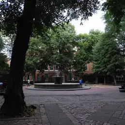
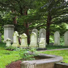
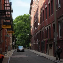
Classic plan elements in Boston..
People love the Parisian boulevard atmosphere of 200 feet (60 m) wide Commonwealth Avenue, running west from the Public Garden with the park in its median. Olmsted’s 1880s “Emerald Necklace”—linking the Common, Public Garden, and Commonwealth Avenue with a string of parks and Fens that combined woods, water, and garden throughout the city—typified his enlightened Romantic design based on the common experience of beauty.
Architects today could build the rest of the city just as lovely as it had originally been built. Over their dead bodies they insist on doing anything but. For a so-called progressive town, Boston exhibits a weird mix of puritanical thinking and the consistent worst modernist architecture and planning available to cities.
As a city Boston is thus a symbol of much that has gone into the development of the American consciousness, and much of what has gone wrong with its cities. Boston is a poster child for dystopian post World War II urban fabric, equivalent to an urban-architectural eugenics live testing lab. Every possible theory was tried on it, and the scars, open wounds and not-healing tissue abound. With the presence across the river of Gropius at the GSD, and the pressure of architectural graduates on its great traditional practices Boston changed rapidly after World War II.
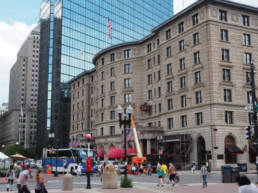
Matching the Custom House in height but far exceeding its mass, the 26-story, 495-foot (151 m) Old John Hancock building by Cram and Ferguson was completed in 1947. Dwarfing it and spurring the advance of more horrific construction and fabric in Boston, the 52-story 749 feet (228 m) tall (including its radio mast 907 feet, 276 m), Prudential Tower by Charles Luckman was completed in 1964. It was followed in 1975 by the late I.M. Pei’s 60-story John Hancock Tower (790 feet, 240 m).[1][2]
As if on a mission to not only destroy the city’s delicate fabric but to do so in the ugliest ways possible, the Prudential Tower has served as a symbol of bad design in Boston since its inception. Flashy, over-scale, megalomaniacal and shockingly unrelated to the city’s size, standards, or style, its ugly, square shaft offends Boston’s skyline in a “textbook example of urban character assassination.[6] [4] [5]
As if on a mission to not only destroy the city’s delicate fabric but to do so in the ugliest ways possible, the Prudential Tower has served as a symbol of bad design in Boston since its inception. Flashy, over-scale, megalomaniacal and shockingly unrelated to the city’s size, standards, or style, its ugly, square shaft offends Boston’s skyline in a “textbook example of urban character assassination.[6] [4] [5]
I. M. Pei’s monolithic slab of John Hancock Tower is a true disaster. During construction its cost multiplied three-fold, the site’s retaining walls warped, damaging utilities and nearby buildings—including historic Trinity Church—and its 11-foot-high, 500-lb (3.4 m, 227 kg) windows crashed to the sidewalks, forcing police to close off surrounding streets when it got windy. [6] [7] While upper-floor occupants of the building suffered motion sickness from its swaying in wind, the unanticipated twisting of its structure[8] required the installation of a 600-ton tuned mass damper [10] and 1,500 tons of more steel to brace it.[10] Eventually, all its 10,344 windows were replaced, [8][7] and it opened five years late, in 1976.
This engineering opera occurred on the backdrop of the wholesale demolition of the West End as a result of the development of the Prudential Center, and the displacement of people, and disruption of neighborhoods to make way for the apartment towers of Charles River Park. In the process, the wanton demolition and rebuilding of large areas led the city’s redevelopment authority to rename it Urban Renewal.
Where Los Angeles is the posterchild of auto-based urbanism, Boston exemplifies how urban designers abdicate their responsibility to traffic planners. Designing for traffic, they create more traffic, increasingly choking the city, especially its narrow and pretty 18th and 19th century classic plan streets.
The climax of attempting to throttle the city was the six-lane elevated Central Artery opened in 1959. Almost immediately it became clear that it was not working. To fix it, the Big Dig, an 8-to-10-lane underground expressway, was begun in 1991 and opened in 2006. Cost more than 10 times the original cost estimate, at lest $28 Billion, the result is the nation’s 15th nationally ranked bottleneck.[1]
The urban decimation continued. More high-rise office towers went up during the 1970s, 1980s, and ’90s, and many of Boston’s older neighborhoods, most notably the South End, underwent deep renovation. But aside from architects, almost nobody thinks that the products of Boston’s decades of Urban Renewal and and highrise construction are beneficial, let alone beautiful. What they all have in common is that he worst parts of Boston, all built since 1945, are intentionally not classic planned. All the new fabric is built to lower standards than before, it is ugly, and none of it is long-term sustainable. The most notorious monstrosity if not the worst is Boston city hall. What were they thinking?[2]

When it opened in 1969, the American Institute of Architects gave the building an Honor Award, the Michelin Green Guide gave it two stars for being controversial, The Boston Globe lauded its “clarity,” the New York Times praised the building’s monumentality, dismissing critics as sentimental for thinking it was austere or forbidding. The AIA Guide to Boston mentions Boston City Hall as “the great building of twentieth-century Boston,” and a 1976 poll of architects named it one of the 10 most important buildings in America. Set in a vast vacant plaza, the City Hall is composed of irregularly protruding concrete boxes resting on thin prismatic columns with rows of windows lining its overhanging floors. [1]
Stylistically, City Hall is considered by some to be a leading example of Brutalist architecture, which is just as barbaric as it sounds. Based on rough forms in crude exposed concrete, its greatest attribute is its lack of durability despite its massive appearance. Although it is designed to mysteriously appear utilitarian, there is nothing inherently useful in its forms and spaces. Alternately overlarge and cramped, its spaces are more a Piranesian ode to Le Corbusier than anything else.[2]
In the deranged demagoguery that makes the brutish desirable, the designers sold their design to the competition jurors on the basis that new city hall would serve as “a keystone between the historic past and the brilliant future which is to come.” But the attempt to render Modernist architecture as monumental as the classical simply fails because Modernist styles lack the details and humanistic proportions that the classical method inheres. In the coarse, crude, concrete Brutalist architecture of this candidate for ugliest of world city halls not even a single foot of its concrete is designed with the intelligence inherent in a single keystone.[3]
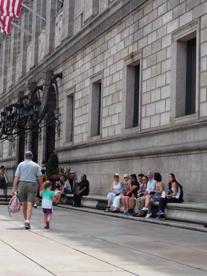
Compared to the Boston Public Library, a place characterized by material warmth and the light of intelligence, City Hall’s spaces are unpleasant, dysfunctional, and dispiriting. The structure’s complex interior spaces and sometimes-confusing floor plan are not mitigated by quality wayfinding, signage, graphics or lighting. Ridiculous in terms of its energy costs, no “green” strategy could save it. So why was it built like it was?
One of its creators was quoted as saying, “We have moved towards an architecture that is … involving itself with the social and geographic context, … rather than an uncommitted abstract structure that could be any place and, therefore, like modern man— without identity or presence.” Clearly the words don’t fit the music. Their style makes no sense intellectually, aesthetically, or practically. A hint to what they were after came on the 50th anniversary of the building’s design, when its architect insisted that Boston City Hall was intended to be “awesome,” not pleasant.[1]
Indeed, while beauty is a pleasure-based aesthetic experience, sublime “awesomeness” is its opposite, a terror and pain-based aesthetic experience. Boston City Hall is designed in the architecture of pain and its plaza stands empty because there is no reason for people to experience its presence. That staunch Modernists hail City Hall Plaza as a “Marvel of Modernism” shows both how detached from real urban experience they are and how low is are their expectations from their own designs.[2]
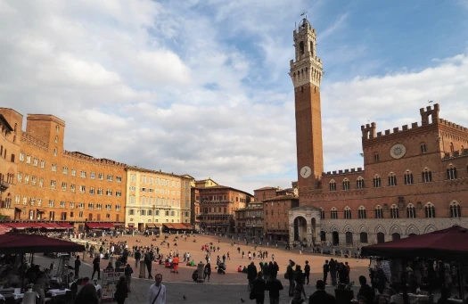
The plaza is a brick desert. Any comparison of it to the Campo in Siena—notably because of their sloped sites—is ludicrous. The occasional concert or ice rink installed in it are inauthentic and fake. “A truly successful public space doesn’t need a circus tent, a craft fair, or some other gimmick to attract the public. People go there because they want to, because it’s a pleasant place to be. That’s just not the case with City Hall Plaza.” Desolate, dreary, and likely irredeemable, in 2004 the Project for Public Spaces identified Boston City Hall Plaza as the single worst public plaza worldwide and put it on the organization’s “Hall of Shame.” [1]
Architect Robert A.M. Stern summarized the matter thus: architects love City Hall and the public hates it. Rephrased it means that for some reason contemporary architects love to create designs that appear hateful to their intended users. [2] The building’s birth was not auspicious. Boston Mayor Collins gasped at the design’s unveiling and someone in the room blurted out, “What the hell is that?” At its opening, one critic said it looked “like the crate Faneuil Hall came in,” and a city councilor quipped that “the only thing missing is the gas pumps.” [3]
Bostonians have described the building as a “fortress” and “dungeon;” an off-putting, dark and unfriendly eyesore. In 2006 Boston Mayor Thomas Menino proposed selling the building because it was unfriendly and cold, and in 2008, a casual poll voted Boston City Hall the “World’s Ugliest Building.” In 2013 the Boston Globe advocated its demolition because it was “the worst building in the city.” [4]
So widely and vehemently hated, one wonders why and how such an ugly design was built in the first place. Even starry-eyed lovers of Brutalism have moved from thinking of Boston City Hall as the greatest building in history to discovering that much of the criticism levelled at it is compelling and cogent. The fact is that an immature studio project, by architects invested in what from the outside appears like an artistic cult, was built to house a city hall for the great city of Boston. [5]
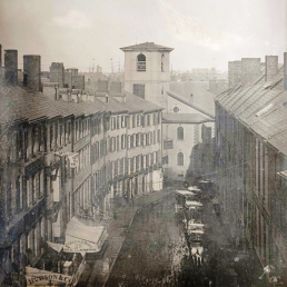
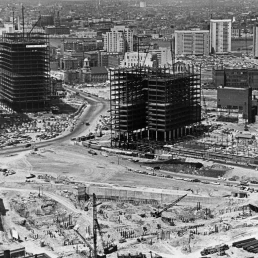
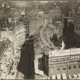
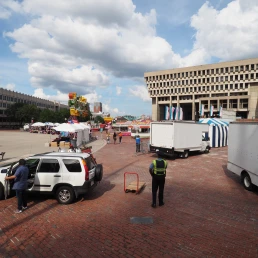
The planners of Boston’s mid- and late-century Modernist projects had no urban idea what they were doing.
Excuses—being one of very few Brutalist public buildings in Boston, the change in political focus from centralized civic power in the city center to decentralization power in the neighborhoods, inadequate funding for long-term maintenance, the need for costly upgrades of lighting and mechanical systems, the lack of coherent signage, and post-9/11 security—do not make up for its dysfunction.
Most people do not believe it is an appropriate symbol of Boston and its democratic government. Clearly, if the building represents Boston, the city is beyond redemption. This building clearly represents bureaucracy at its worst, subservient to political and architectural bullying, adopting an urban barbarism embedded in a self-described Brutalist style.[1]
The problem with Boston City Hall isn’t the utter lack of “activity generators” at its edges. The problem is that Boston City Hall, its Plaza, and the urbanism around them are all wrong. The buildings and streets effectively form barriers to the surrounding fabric. The Boston Globe wrote in 2013 that City Hall was so ugly that its insane upside-down wedding-cake columns and windswept plaza distracted from the building’s true crimes: its ugliness, anti-urbanity, and how the scary building and empty plaza keep a whole city at arm’s length. Consider the futility of the city calling on the building’s golden anniversary yet again to its citizens for ideas to somehow make the building palatable. [2]
For a city that claims to cherish its history, tearing down City Hall would be an act of mercy. It would not be akin to tearing a chapter out of a history book, because the building occupies the void left when whole pages of its urbanism were ripped out. Traditional replacement and healing will retell the urban history that was obliterated, and a new classical building would continue the history of Boston in a manner that its people love. The new fabric would be healing rather than disruptive.
Cities and buildings are backdrops for human activity and measured by the individual experience of beauty. Founded not in designer ego but in human perception, classic planning is the humane alternative to the dystopias created in Boston and promoted by todays media and planners. Driven by community aspiration, reflecting the magic of place and balancing town and country, classic planning is sustained by durable buildings, it enables their long-term reuse.
Poor Boston. If there is a city that needs classic planning, it definitely is Boston. After all, you don’t want the people who generated this mess to try to fix it, now do you?
End Notes:
[1] https://www.bu.edu/today/2018/sirman-boston-city-hall
[2] McMorrow, Paul (September 24, 2013). “Boston City Hall should be torn down”. The Boston Globe; Tom Acitelli. Boston City Hall turns 50: Love it or hate it—there remains no middle ground regarding the brutalist complex, Curbed.com (website). 7 Jan 2019. https://boston.curbed.com/2019/1/7/18168336/boston-city-hall-turns-50-2019. See also https://www.theboxerboston.com/blog/love-it-or-hate-it-bostons-iconic-city-hall/; to reimagine City Hall
[1] https://www.bu.edu/today/2018/sirman-boston-city-hall/; Project for Public Spaces (PPS) is a nonprofit organization based in New York dedicated to creating and sustaining public places that build communities. “15 Squares Most in Need of Improvement”. Project for Public Spaces; “City Hall Plaza – Hall of Shame”. Project for Public Spaces. Archived from the original on 31 January 2016.
[2] https://www.bostonglobe.com/ideas/2012/02/12/how-boston-city-hall-was-born/DtfspyXVbKBIKi8iSXHX6J/story.html
[3] https://www.bostonglobe.com/ideas/2012/02/12/how-boston-city-hall-was-born/DtfspyXVbKBIKi8iSXHX6J/story.html; http://www.celebrateboston.com/strange/government-center.htm; Thomas, Jack (2004-10-13). “‘I wanted something that would last’”. Boston Globe.
[4] By the travel agency virtual tourist.org; The civic heart of the city, Globe Editorial, The Boston Globe, 13 December 2006; The Boston Globe City Hall Should Torn Dow; Boston City Hall tops ugliest-building list. The Boston Globe; reuters.com Travel Picks: 10 top ugly buildings and monuments.
[5] https://www.bu.edu/today/2018/sirman-boston-city-hall/; https://www.amazon.com/Making-Dystopia-Survival-Architectural-Barbarism-ebook/dp/B07DPNR7FL.
[1] Gerhard Kallmann. Quoted in Paul Heyer. Architects on Architecture: New Directions in America. p260, in Great Buildings Online, http://www.greatbuildings.com/buildings/Boston_City_Hall.html; https://www.nytimes.com/2012/06/25/arts/design/gerhard-kallmann-architect-dies-at-97.html
[2] “Landslide 2008: Marvels of Modernism / The Cultural Landscape Foundation”. tclf.org.
[1] “Boston City Hall”. American Institute of Architects; “Boston City Hall”. The Green Guide. Michelin Travel; Huxtable, Ada Louise (11 September 1972). “New Boston Center: Skillful Use of Urban Space”. The New York Times. Retrieved 22 October 2016, Freeman, Donald (1970). Boston Architecture. The MIT Press. p. 57; Lyndon, Donlyn (18 March 2007). “Why City Hall is worth saving”. The Boston Globe; Southworth, Susan; Southworth, Michael (2008). AIA Guide to Boston (3rd ed.). Globe Pequot Press. p. 52.
[2] https://en.wikipedia.org/wiki/Brutalist_architecture
[3] https://www.bu.edu/today/2018/sirman-boston-city-hall/
[1] https://www.bostonmagazine.com/news/2015/11/24/boston-highway-bottlenecks/
[2] Tom Acitelli. Boston City Hall turns 50: Love it or hate it—there remains no middle ground regarding the brutalist complex, Curbed.com (website). 7 Jan 2019. https://boston.curbed.com/2019/1/7/18168336/boston-city-hall-turns-50-2019
WELCOME!
Get In Touch
Please get in touch with us
to discuss your requirements.
Please get in touch with us
to discuss your requirements.
